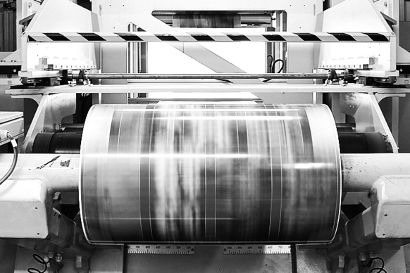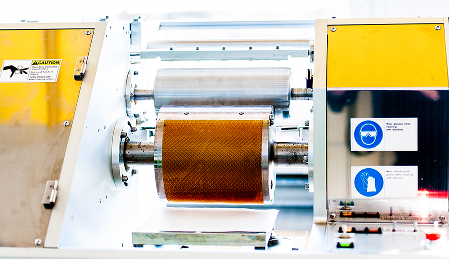
At the DFTA Technology Center we are probably using the most advanced flexoprint test forms.From 1-colour to 5-colour printing, we cover the entire range of packaging printing. Our test printing forms are particularly meaningful through the compilation of various elements that explicitly emphasize individual details of the print result and make them separately assessable, apart from other details. In the following, the most important of these are explained using the example of our 4-colour high-quality flexographic printing test form, whereby the latest findings in application and evaluation are acknowledged.
The usual suspects: solid tones and stepped gray wedges
No test printing form can do without: full tones and step gray wedges. The solid fields we need to assess the solid density and the lay-down of the ink, which likes to spread a little unevenly on the substrate and so-called pinholes - white areas without colour coverage, but you can usually see them only with the microscope – are left open. Our test form has several different solid blocks and stripes. Some of them are mainly due to the study of ghosting. These can be seen - if they occur - quite well in the lower band. Of course, each of the stepped gray wedges starts with a solid block at the top. This serves as a reference for the calculation of the halftone area coverage. Here are three things worth mentioning:
On the one hand, our stepped gray wedges are available in duplicate. The fact that the individual colours have different widths is a secondary scene - cyan and magenta are mainly needed for further evaluations and therefore have full width, yellow and black are usually only visually evaluated. The doubling arises from the idea of wanting to examine two different halftone screenings at the same time. This can then be two different lineatures/rulings of a particular screening, or - as is usually the case in our practice - two different screening systems of a common ruling. This helps to be able to make good decisions about optimizing the printing condition and is practiced in many other such test forms.
Secondly, our stepped gray wedges are geometrically very long, with the "lower end" in particular being very finely graduated. It contains the smallest possible increment of tonal levels possible in digital image processing, namely approx. 0.4% (which, in practice, means that the ominous "1-percent" is not really possible and therefore is not present here). We have acquired this because, with this "vignette" of the stepped gray wedge, you can check the lower levels - especially the possible "hard end" - very well for its position and percentage. The latter is one of the most important aspects of knowledge about a printing condition (printing condition = combination of printing machine + printing ink + anilox roller(s) + printing plates + substrate + ...). And third, we measure the so-called print characteristics, ie the gradation of the printed halftone values on the tonal scale from 0% to 100%, today no longer (only) with the "area coverage function" of the densitometer (in which logarithmic density is converted into halftone area coverage according to the Murray-Davies formula), but according to the new ISO 20654 standardized new SCTV formula. In contrast to the Murray-Davies, this provides a linear response, so it can be used directly for the creation of compensation curves and describes an objective optimum of the printing characteristic, if one "hits" the diagonal in the diagram. In addition, SCTV is also suitable for halftones in special colours.
All this is NOT true for "the Murray-Davies". Printing characteristics, together with colour profiles, are probably the most important benefit of printing a test form. They illustrate possible deviations from the ideal (especially when using SCTV) and allow the much needed compensation curves for the printing plate production, without which the colour profiles would work less well and stable.
Image in PDF
In addition to the stepped gray wedges, photos are also part of the "basic equipment" of such test forms, although they are hardly technically evaluable. However, printed photographic images mostly refer to the end use of the printing condition and allow the skilled operator to visually assess overprint colours and areas which the single colours printed in the stepped gray wedges do not allow for. The images in our test printing form are, on the one hand, divided diagonally and, on the other hand, repeated several times. The diagonal division opposes two different colour separations within an image and is sometimes recognizable by the diagonal becoming visible. The vertical text left and right shows which two different types of separation are compared here.
The left half of the picture above the diagonal is constructed in each case according to the offset printing standard. Such images are often supplied to us by the agencies, although it would be technically better to deliver the original RGB data. If this half of the image still looks attractive in flexographic printing - which is generally the case in our practical experiments - then that is a visible proof of the quality that flexographic printing can now achieve.
The images are of course present several times because, again, the two mentioned different screens are used separately. However, a further doubling results from the fact that in some cases a second type of colour separation is also shown (once each GCR maximum and GCR None). The Repro expert can thus estimate which of the colour separation methods is better suited for the present printing condition (where only the extremes are staked and certainly finer considerations and the incorporation of experience are necessary).
In our test form, the images have recently been overlaid with the Digimarc Barcode watermark to show the user how this changes a photographic image. We always incorporate the Digimarc Barcode in different "strength variations" into the test form so that you can also examine this differentiation visually and with the tester (for example smartphone).
Gray Balance
Image in PDF
Even though it is often taken for granted today, gray balance is still one of the most important criteria of "well balanced printing". Although the gray balance should be regulated by the relevant colour profile (see later), this is exactly why there is a "hen and egg problem" here. If you leave the gray balance completely to colour management, then this will in the ideal case cause the gray condition - the mutual balancing of the colourful process colours - but if the necessary colour profile was already based on a poorly balanced printing condition, then colour management can at best be this imperfect condition´s "cement". In the realistic normal case, however, there will probably be rather large fluctuations between the print jobs: sometimes the proof fits well with the print, sometimes not at all.
To determine the gray balance or the so-called gray condition, the author has some time ago conceived and developed the schema of the hexagons with seven fields shown here. It is now used worldwide, but very few users really know how to handle it. For the evaluation, one needs a corresponding calculation sheet that can perform the matrix calculation to be performed with the six colour vectors in the CIELab colour space. However, its user can then expect to achieve maximum accuracy.
With the obtained information on the proportions in which the process colours (for example cyan, magenta, yellow) mutually neutralize one another via the tonal value curve, that is to say, the savvy user can judge whether the printing condition in question is "in balance". If one of the printing inks deviates strongly from the others in terms of colour strength or dot gain, then this can be interpreted at least as the first alarm signal and, if necessary, countermeasures can be taken. Overall, the charm of knowing the gray balance is in the ability to convert print motifs as easily as possible from one printing process to another, if both parties each meet the gray balance. Naturally, colour profiles can also contribute something here, but they work better the more neutral the gray balance is maintained.
Maximum Ink Coverage
Image in PDF
In multi-colour printing, of course, we would like to achieve rich depths, and in Repro, several printing inks are laid one over the other in places. Upon reaching a certain amount of ink in the overprint, however, further amounts of ink are no longer accepted by the substrate and can cause problems in drying or on web guide elements in the printing press. We are therefore always looking for the maximum amount of ink at which the printing condition at hand produces an optimum density or blackening. This can be done with a classic small arrangement by which the participating inks are graded differently in the X direction and Y direction. Then you go with the densitometer through the resulting 25 fields and pick out the one that has produced the highest density. If there are several similarly high densities that the human eye normally can not distinguish anyway, one chooses the field with the lowest total sum of area coverage. This investigation is also called TAC (Total Area Coverage).
Our specialty in the DFTA Technology Center is in this case the alternative use of the L* value from the colour measurement as a decision criterion. Inverse to the density, the lowest brightness value in the 25 fields is searched here, but all our experiences say that this is consistent with the density maximum. The only advantage of using the L* is that you do not have to change the device mode if you're practicing practically everything in the Lab mode of the measuring device. In addition, it is more plausible to create an absolute default for a target value for the L* value than with the densitometric density. This may be important in communicating specifications with the customer.
Color management in compact edition
Image in PDF
Today, colour management naturally belongs to the modern "fingerprinting" of a printing condition. In this respect, a corresponding test print form must also contain a component from which one can produce a colour profile. In the present case, these are even four different, alternatively to be used elements. The example shows the version of a Mini Target proposed by the company ColorLogic, but in the lower part there are also two different proposals from the company GMG Color and on the far right our test form has a suggestion from our own house, which we internally titled "Zebra stripes".
From one of these four options, the user can compute a colour profile of the given printing condition, partly with the help of specific software. With this we would like to once again propagate the idea we put forward in the early 2000s to extrapolate colour profiles from a limited set of colour patches. In our opinion, this gets more and more important the closer we get to Fixed Color Palette printing (which we probably face in light of advances in digital printing), especially if it involves more than CMYK's standard process colours. In the latter case, the space on such test printing forms becomes scarce very quickly, if one must accommodate the otherwise usual colour management charts with some more than 1500 patches.
Such colour management test elements are of course measured and evaluated with the spectrophotometer, ideally even using the full spectral data. At this point, the reader should perhaps understand a bit better, why it is so important to us, to be able to evaluate the remaining parts of the test printing form such as the stepped gray wedges entirely spectrophotometrically. The trivial reason for this is we do not want to have to constantly change the measurement mode of the device. The main scientific reason is that one can obtain "better" data spectrophotometrically.
Dynamic Register, Moiré and Colour Drift
Images in PDF
Of course, good register is one of the basic requirements for good print quality in multicolour printing. In addition to the usual registration marks and microdots, which are mainly used for setting up the press, we always strive in our investigations to gain knowledge about the dynamic registration behavior of a printing condition. This is of course mainly the printing press´s responsibility, but possibly also that of the substrate or the printing plates. For the high-precision analysis of the register situation we have developed the test elements shown here. The round so-called Moiré Clock shows a very characteristic interference pattern, which reacts disproportionately to register differences. Due to its shape, strong response and size, it is suitable for the investigation of the dynamic registration behavior in the production. Successive Moiré Clock print images show us how repeatable the combination of printing press and printing material works after a registration situation has been set. With active register control, we can estimate its accuracy and speed.
The smaller so-called vernier registration element also works via interference effects. The two inks to be tested here get fine, slightly oblique lines. The position of the interference pattern on the scale provides very precise information about the registration setting and helps the user to be even more precise in the setup process without having to fall back on measuring microscopes. In contrast to the previously described "dynamic" register evaluated by the Moiré Clock, the vernier element, so to speak, supports the registration´s basic setting, which could also be called a
"static" or "systematic" register. Both elements - the Moiré Clock and the vernier element - are usually first read with the naked eye. Only when, for some reason, exact measured values are needed, a measurement microscopic examination takes place. This can easily be very complicated in data acquisition and, above all, in interpretation.
Assuming appropriate experience, one can estimate with the knowledge of the registration behavior of a printing condition the possible occurrence of two unpleasant phenomena: Moiré in multicolour printing with AM screens and the colour drift which then possibly occurs. If necessary, however, we also check this in concrete terms with the technical tints in the colour stripe called "Moiré-Test". These colour combinations have a double diagonal pitch. The visually clearer one (see figure) simply separates the 25% tone value from the 50% tone value, so that the respective combined process colours can be viewed in two different, neuralgic tonal values. The usually less clear second diagonal pitch runs transversely to the former and thus divides each triangle again in half. We then give them different halftone screen angle combinations. For example, one half receives the "normal" screen angles with a mutual rotation of 30 ° or 15 °, while in the second half we arrange all inks at the same screen angle. The resulting print image then shows very clearly which effect the register-dependent parameters moiré and colour drift would have for our colour representation. In addition, the registration behavior is increasingly important for the following aspect:
Fixed Colour Palette: Lines and Text
Images in PDF
When printing with a fixed colour palette, all shades are consistently constructed from the existing 4 to 7 primary colours, mostly by the so-called halftone colour mixture. In the (theoretical) ideal case, the printing of spot colours can thus be avoided. However, as soon as this is practiced for smaller text or finer lines, the achievable register is immediately the main criterion, which effectively closes the circle to the aforementioned aspect of the examination of registration quality. The elements contained in our test print form are somewhat descriptive. Normally they are not evaluated metrologically, but rather should make it possible to assess what may possibly happen with the appearance of such a multicoloured text or a line in the event of a registration fault. Due to the double presence, however, a direct comparison between the two halftone screens used can be drawn. For example, the fine rounded lines show very well that a frequency-modulated halftone screen typically represents them much more responsive and closed than an amplitude-modulated halftone screen.
Digimarc Barcode and DFTA Planoflex
Image in PDF
Digimarc Barcode is our current hot topic in packaging printing. In order to gain experience, we have integrated the code as a watermark into the present test form, in several places with different characteristics. So by printing the test form, you, as a user, can get your own impression of whether you can successfully implement the watermark code in production. But even here there are certainly shares with descriptive character. In the illustration, eight seemingly identical photos with meat images can be seen. The upper four are assigned to one and the lower four to the other halftone screen. In the horizontal, however, the comparison of the different pairs is even more meaningful. They are superimposed with different strengths of the Digimarc barcode. This allows us - intentionally - to clarify how the digital watermark changes the look of the photo and thus influences the perceived print quality. These four levels are also suitable for testing, because you can try out the readability with your smartphone. We used our "DFTA Planoflex" Version 2 process for the above-mentioned surface overlay. This method, which was originally intended only as a food for thought, here causes a considerable simplification and, incidentally, even in the printing press any vibrations are dampened.
Signal Elements
Images in PDF
Of course, all test molds we design contain our self-developed signal elements, which allow us to control mainly the setting of the press. For example, it is very valuable to already know that the cylinders have been set parallel to each other, and we therefore check this with the so-called anilox roll signal element (RWBK, see figure). However, the term "staircase" has also become commonplace. According to this manner, there are a few more such signal elements in the test printing plate at hand. Depending on the type, they also signal the pressure between the printing form and the substrate, the relationship between the printing form and the anilox roller with respect to the Anilox volume and angulation, as well as the correctness of the relative surface speeds in the printing nip (so-called unwinding). Signal elements of this type are naturally purely informative in character and are usually not measured. Rather, they are intended for viewing and visual interpretation by the skilled operator, who then improves the appropriate settings accordingly.
Conclusion
Test printing forms are designed to test printing conditions thoroughly, to optimize them if necessary and finally to profile them. The current four-colour test printing form from the DFTA Technology Center is particularly comprehensive and was used here as an example for a practical explanation of the commonly used test elements. The DFTA Technology Center and its team are happy to provide further information and assistance.
Stuttgart, December 2019
Prof. Dr. Martin Dreher
Scientific Director DFTA Technology Center